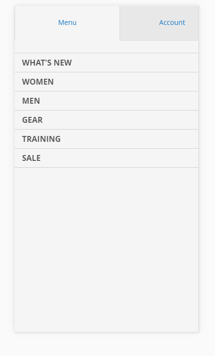
How to make it Magento 2 mobile menu to open up from the top to bottom instead of opening it up from left to right. ( just like how WordPress mobile version does )
1 Answer
@media="screen and (max-width: 767px){
        .nav-sections {
            background: #eee;
            -webkit-transition: top 0.3s;
            -moz-transition: top 0.3s;
            -ms-transition: top 0.3s;
            transition: top 0.3s;
            width: 100%;
            top: -80%;
            top: calc(-1 * (100% - 54px));
            overflow: auto;
            position: fixed;

            left: auto;
            height: 80%;
            height: calc(100% - 54px);
        }
        .nav-open .page-wrapper {
            top: 80%;
            top: calc(100% - 54px);
        }
        .nav-before-open .page-wrapper {
            -webkit-transition: top 0.3s;
            -moz-transition: top 0.3s;
            -ms-transition: top 0.3s;
            transition: top 0.3s;
            width: 100%;
            overflow: hidden;
            position: relative;
        }
        .nav-open .nav-sections {
            -webkit-box-shadow: 0 0 5px 0 rgba(50, 50, 50, 0.75);
            -moz-box-shadow: 0 0 5px 0 rgba(50, 50, 50, 0.75);
            -ms-box-shadow: 0 0 5px 0 rgba(50, 50, 50, 0.75);
            box-shadow: 0 0 5px 0 rgba(50, 50, 50, 0.75);
            top: 0;
            z-index: 9999;
        }
}
Replace left with top, transition left with top and width to height as above.
-
Thanks! any change you have some boilerplate RTL theme to share with middle-east developers?:-)– GoldyCommented Feb 15, 2017 at 11:19

