1

I'm trying to use Magento2's .media-width() mixin. I followed the instructions from the devdocs and added the mixin in my theme like this:

.logo img {
  width: 125px;
  height: 29px;
  .media-width(@extremum, @break) when (@extremum = 'min') and (@break = @screen__m) {
    width: 250px;
    height: 58px;
  }
}

Only the CSS outside of the .media-width() is being generated. Nothing within it is being generated. Am I missing something.

UPDATE

Following the advice of @circlesix I did not nest the media query, but still I'm having some trouble.

.logo img {
  width: 125px;
  height: 29px;
}
.media-width(@extremum, @break) when (@extremum = 'min') and (@break = @screen__m) {
  .logo img {
    width: 177px;
    height: 41px;
  }
}

My desktop rule in the media query is being overruled by the first rule for .logo img as it is defined later in styles-l.css. enter image description here
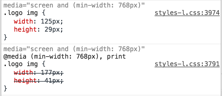
Interestingly I don't see the rule I defined within the media-width() mixin defined anywhere within styles-m.css. So perhaps I need to use the media-width() for both desktop & mobile views and only define common properties outside of it?

2 Answers 2

3

Ok, so I discovered a little more about this but as @circlesix pointed out it's not possible to use these LESS mixins nested like this.

Furthermore if you look at the <head> section of Magento you'll notice that the styles-l.css is loaded after the mobile styles, i.e. styles-m.css.

<link  rel="stylesheet" type="text/css"  media="all" href="http://example.com/pub/static/frontend/Magento/luma/en_US/css/styles-m.css" />
<link  rel="stylesheet" type="text/css"  media="screen and (min-width: 768px)" href="http://example.com/pub/static/frontend/Magento/luma/en_US/css/styles-l.css" />

So styles-l.css is only loaded on screens 768px and over in width, saving mobile devices from having to load it.

If you write a LESS rule like normal without any of the mixins it will be put into both of these files and anything you add to with the media-width() mixin will be added before it, and therefore overwritten.

You can use the @media-common = true separation variable to output it only to styles-m.css before any of the media query rules are added. This way it will be applied to both desktop and mobile devices, as both load styles-m.css.

media-width() mixins under 768px are only put in styles-m.css, vice-a-versa any media-width() mixins 768px over in width is only put in styles-l.css.

So, I think the best practice is to put all your common styles within & when (@media-common = true) {} and use the media-width() mixin for any css rules which are specific to a particular width.

For instance, below is what I went with in the end...

//
//  Common
//  _____________________________________________
& when (@media-common = true) {
  .logo img {
    width: 125px;
    height: 29px;
  }
}

//
//  Mobile
//  _____________________________________________
//.media-width(@extremum, @break) when (@extremum = 'max') and (@break = @screen__m) {}

//
//  Desktop
//  _____________________________________________
.media-width(@extremum, @break) when (@extremum = 'min') and (@break = @screen__m) {
  .logo img {
    width: 177px;
    height: 41px;
  }
}

It's the same approach used by Magento in:

  • app/design/frontend/Magento/blank/web/css/source/_navigation.less
  • vendor/magento/theme-frontend-blank/web/css/source/_navigation.less
3
  • well put! did you try having the nested styles inside the media-common = true? Given what you are finding, it might be possible to nest the media queries if you configure it differently then the way i have been doing it. Might be worth a try and see what the results are.
    – circlesix
    Commented Mar 30, 2017 at 13:04
  • @circlesix just tried nesting the media-width() mixin within the media-common = true mixin and it didn't work. It's not the way they do in the magento core either so I think it's best to keep it to the pattern above.
    – Holly
    Commented Apr 1, 2017 at 15:51
  • Awesome! Such a good explanation!
    – phagento
    Commented Jun 14, 2019 at 13:09
1

Using the the core files as an example for how to use that mixin, i don't think you can have them nested in that way (even though i think that is the preferred way to use media queries).

Looking at a file in core like vendor/magento/theme-frontend-luma/Magento_Theme/web/css/source/module/_collapsible_navigation.less

//
//  Desktop
//  _____________________________________________

.media-width(@extremum, @break) when (@extremum = 'min') and (@break = @screen__m) {
    .block-collapsible-nav {
        .title {
            &:extend(.abs-visually-hidden-desktop all);
        }
    }
}

//
//  Mobile
//  _____________________________________________

.media-width(@extremum, @break) when (@extremum = 'max') and (@break = @screen__m) {
    .block-collapsible-nav {
        left: 0;
        position: absolute;
        top: -21px;
        width: 100%;
        z-index: 5;

        .title {
            &:extend(.abs-toggling-title-mobile all);
        }

        .content {
            border-bottom: @border-width__base solid @border-color__base;
            display: none;

            &.active {
                display: block;
            }
        }
    }
}

You see that each css class is repeated into a media query container. I don't know if there is another way to do this, but i have stuck to this pattern and it works.

One thing that helps is to have very small .less files in your theme, as it reduces that amount of scrolling you have to do to find what you are looking for.

0

Your Answer

By clicking “Post Your Answer”, you agree to our terms of service and acknowledge you have read our privacy policy.

Not the answer you're looking for? Browse other questions tagged or ask your own question.